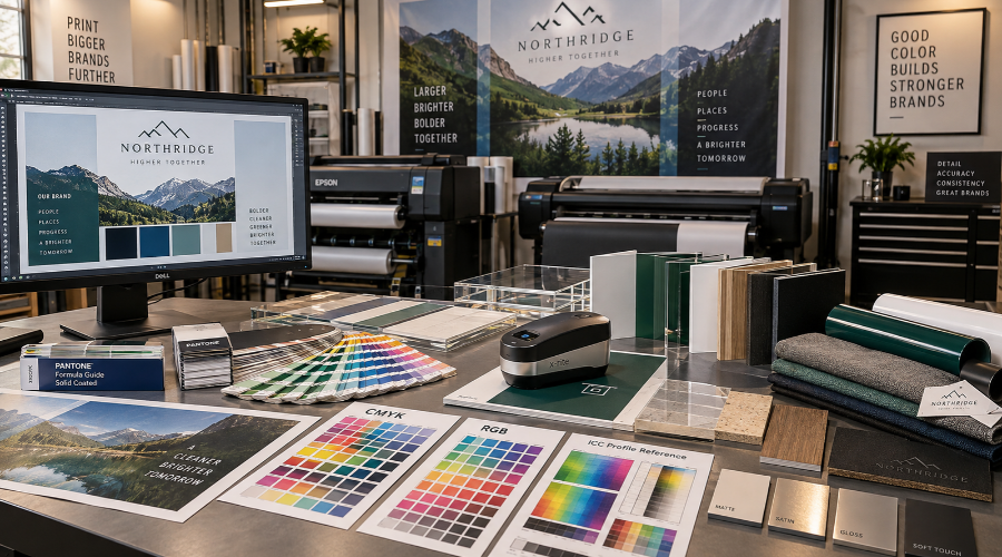
Explaining Color Theory and Its Impact on Brand Perception
Color shapes how people read a space before they read a word. When we plan environmental graphics, we look at hue, value, saturation, contrast, and lighting together. Each factor affects how a logo, wall graphic, sign, or window display feels in context.
For example, a deep blue may communicate stability in one setting. However, that same blue can look dull under warm interior lights. A bright red may create urgency on a banner. Yet, it may feel too aggressive when used across a full wall.
We also consider how color supports wayfinding and customer movement. High contrast can help visitors locate entrances, departments, or service areas. In addition, softer palettes can support longer dwell time in offices, showrooms, clinics, and hospitality settings.
Color also carries memory cues. When someone sees the same brand tones across signs, murals, dimensional letters, and fleet graphics, the space feels connected. As a result, each visual touchpoint supports the next one.
Because materials change color behavior, we test how inks, vinyls, paints, laminates, and substrates interact. Matte finishes absorb light. Gloss finishes reflect it. Transparent films depend on glass tint and background color. Therefore, a color decision should never live only on a screen.
Color Matching for Brand Consistency: Industry Standards and Technologies
Accurate production starts with a clear color target. We use brand guides, Pantone references, CMYK builds, RGB values, and physical samples to understand the desired result. Then, we connect those targets to the right output method.
Digital files alone do not guarantee a match. Monitors, printers, materials, and lighting conditions all influence the final appearance. Instead, we rely on color-managed workflows and production checks to keep results aligned.
Several tools and references help us control color across graphic applications:
- Pantone and spot color references for defined brand targets
- ICC profiles for printer, ink, and substrate combinations
- Printed proofs for review before full production
- Spectrophotometer readings to measure color differences
- Lighting reviews for offices, retail spaces, campuses, and exterior settings
Also, we separate color intent from production reality. A brand orange may look correct on coated vinyl but shift on fabric or painted board. So, we adjust the production recipe while protecting the approved visual direction.
When projects include multiple surfaces, we coordinate output across departments. This matters for wall coverings, window graphics, floor decals, ADA signs, and exterior panels. Meanwhile, our team checks how each product fits within the complete visual system.
Common Challenges and Solutions in Environmental Graphic Color Matching
One common challenge comes from lighting. Daylight, LEDs, fluorescent lamps, and shadows can change how color appears throughout the day. Before production, we discuss where the graphics will live and how people will view them.
Another challenge comes from scale. A small swatch can feel balanced, while a large wall installation may feel much stronger. Consequently, we may recommend samples at a larger size before moving into full production.
Material variation can also create shifts. Vinyl, acrylic, aluminum, fabric, paper, and paint accept color in different ways. We account for those differences during file setup, proofing, and output.
Installation conditions matter as well. Curved walls, textured surfaces, tinted windows, and existing paint colors can affect the final look. However, early site review helps us identify those issues before they create delays.
Best Practices for Achieving Reliable Color Matching for Brand Consistency
Maintaining strong color consistency across different environmental graphics is not just about choosing the right swatches. At Riot, we recognize that precise color matching for brand consistency forms the foundation of a cohesive brand identity. Our approach starts with a thorough understanding of your brand guidelines and the selection of the correct materials for each application – whether it’s a wall mural, wayfinding system, or window graphic. We rely on calibrated equipment and regularly updated color profiles to ensure that what you approve on-screen is faithfully reproduced in every physical environment. Collaboration with your marketing and facilities teams allows us to anticipate environmental variables, such as lighting and substrate, that can impact color perception. By standardizing processes at every production step – from initial proofing to final installation – we help guarantee consistent results, project after project.
The ROI of Strong Color Consistency in Environmental Graphics
Investing in reliable color matching delivers measurable value. Consistent visuals across multiple locations reinforce brand recognition and nurture customer trust. When customers experience your brand in different spaces – stores, offices, event venues – they should feel the seamless continuity of your message. Our clients see lasting impact from this attention to detail: improved customer impressions, greater employee engagement, and stronger brand equity. Avoiding errors and costly reprints further enhances your return on investment.
Choosing an Expert Partner to Ensure Flawless Brand Colors
Selecting the right collaborator for your environmental graphics is critical. At Riot, our environmental capability encompasses every aspect required for color matching for brand consistency. We leverage industry-standard tools and ongoing training to address common challenges in graphics production, from color drift over time to adapting designs for new surfaces. Our team partners with you from initial site assessments through final installation, providing transparency at each checkpoint. As experts focused on environmental graphics, we deliver solutions that align with your brand expectations and space requirements. By prioritizing both process and partnership, we help keep your brand colors on point, wherever your visuals appear.
FAQ
What are environmental graphics and how do they impact branding?
Environmental graphics are visual elements such as murals, signage, and custom installations that shape how your brand is experienced in physical spaces. By integrating these graphics, we create immersive brand environments that communicate your story, values, and personality. Consequently, this helps foster deeper connections with your audience and reinforces brand recognition at every touchpoint.
Why is color consistency so important for brand recognition?
Color is a powerful visual cue that triggers instant association with your brand. When we use consistent colors across all your brand touchpoints, we build stronger recall and trust among your audience. Inconsistent colors, however, can dilute your brand identity and make your message less memorable, which is why we prioritize precise color matching in every environmental graphics project.
How does color theory influence the perception of a brand?
Color theory guides how we select and apply colors to evoke specific emotions and perceptions. For instance, blue often conveys trust and stability, while red suggests energy and excitement. By leveraging color theory, we can help position your brand as intended and create environments that resonate emotionally with your audience, ultimately enhancing the impact of your branding.
What industry standards and technologies do we use for color matching?
We employ advanced color measurement tools, precision printing technologies, and adhere to industry standards like Pantone and CIE color systems. These allow us to achieve reliable color consistency across various materials and substrates, ensuring your brand colors look the same in every environment. Because of these rigorous processes, our clients benefit from flawless results every time.
What challenges do we encounter when matching colors in environmental graphics?
Environmental graphics must often adapt to different materials, lighting conditions, and production techniques, which can make precise color matching tricky. However, our team stays proactive by conducting thorough site surveys, using calibrated equipment, and performing on-site color tests to overcome these challenges. As a result, we deliver matching colors across all surfaces and installations.
How do we address color inconsistencies caused by varying materials?
Different materials absorb and reflect color in unique ways, which can lead to variations. To tackle this, we carefully test inks and finishes on each substrate and adjust print profiles accordingly. Through our tailored approach, we ensure your signature colors retain their vibrancy and uniformity regardless of the material being used.
Can environmental graphics help increase ROI for brands?
Absolutely! When your brand colors remain consistent across spaces, you boost customer recognition, trust, and engagement, all of which contribute to increased ROI. By investing in expertly designed and flawlessly matched environmental graphics, you lay a strong foundation for brand loyalty and long-term business growth. This strategic approach pays dividends in both measurable and intangible ways.
What are our best practices for reliable color matching?
We start by establishing clear color standards and calibrating our equipment for accuracy. Then, we conduct material-specific tests, communicate closely with suppliers, and document the process for future reference. Thanks to these best practices, you can be confident that your brand colors will be consistent wherever your graphics appear.
How do we collaborate with clients during the color matching process?
Open communication is at the core of our process. We engage with you at every stage, providing proofs, samples, and on-site mockups to gather your feedback. By maintaining transparency, we ensure that the final result matches your expectations and aligns perfectly with your brand guidelines.
Why should you choose Riot as your expert partner for brand color consistency?
We combine deep expertise, industry-leading technology, and a passion for precision to protect your brand integrity. By choosing Riot, you gain a dedicated partner who understands the intricacies of environmental graphics and is committed to delivering flawless color matching, every single time. Let’s work together to make your brand unforgettable in every space it inhabits.