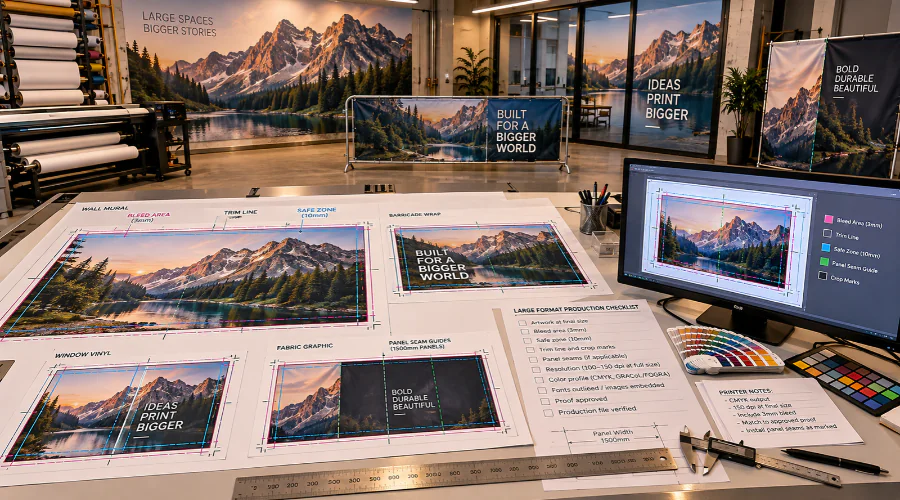
Explaining Bleed and Safe Zone Rules for Big Prints: Ensuring Edge-to-Edge Impact
When we build environmental graphics, we plan for the way material moves during trimming, routing, mounting, and installation. Bleed gives our artwork extra image area past the final cut line. As a result, color and images can run to the edge without a thin white line.
For wall graphics, barricade wraps, window vinyl, and dimensional panels, that margin matters. A small file error can become visible across a lobby, hallway, or storefront. At Riot, we set bleed based on the product, material, and finishing method.
For many large-format pieces, we may use more bleed than a standard brochure requires. However, not every project needs the same amount. A flat panel needs a different setup than fabric, wallpaper, adhesive vinyl, or a routed shape. So, we confirm the final size, viewing distance, substrate, and edge treatment before production.
If artwork includes patterns or full-bleed photos, we extend the background beyond the trim. We also avoid placing key design elements inside that outer extension. Bleed should only carry expendable image area, not logos, text, arrows, icons, or compliance details.
Safe Zone Rules for Big Prints: Protecting Your Content
Safe zones protect the message after printing, cutting, sewing, laminating, or installation. In environmental graphics, this matters because people need to read information quickly. Wayfinding arrows, room numbers, brand statements, and event details need enough space around every edge.
In addition, large graphics often wrap around corners, cover uneven surfaces, or sit near frames and hardware. For example, a window graphic may lose visual space near mullions. A wall mural may meet baseboards, ceiling lines, or door casings. Therefore, we keep critical content inside a clear interior boundary.
Before our team prepares files, we review several safe zone factors:
- Keep logos, text, QR codes, and arrows away from trim lines.
- Allow more space near seams, panel overlaps, grommets, hems, and hardware.
- Place required ADA, safety, or directional information in stable visual areas.
- Check viewing distance so type size supports easy reading.
- Account for installers, corners, obstructions, flooring changes, and lighting.
Also, we avoid designing only for the screen. A layout can look balanced on a monitor but feel cramped at full size. So, we review scale, spacing, and sightlines before we send files forward.
Common Mistakes and How to Prevent Print File Errors (with Sources)
Common file issues often start with scale, resolution, color, and missing margins. However, early checks can prevent delays. We look for artwork that lacks bleed, places content too close to edges, or uses low-resolution images for large viewing areas.
Another frequent issue involves file size. Designers may build artwork at full scale when half scale or quarter scale would work better. In that case, we confirm the scale in the file name, artboard, and production notes. Then we match resolution to the final output size.
Color also needs attention. We review brand colors, rich blacks, gradients, and large solid areas before printing. In addition, we check linked images, outlined fonts, overprint settings, and transparency. These steps help our production team keep the file predictable.
We use guidance from Adobe print documentation, Idealliance color management resources, and PRINTING United Alliance production references. These sources support clear file preparation practices.
The Benefits of Mastering Bleed and Safe Zone Rules for Big Prints
Bringing any environmental graphics project to life begins with a solid understanding of Bleed and Safe Zone Rules for Big Prints. When we prioritize these concepts in our layouts, we avoid surprises at the finishing stage and ensure all visual elements appear sharp, aligned, and exactly as intended – no matter the display context or print size. Properly managing bleed eliminates unsightly white slivers at the edges and guarantees our design extends edge-to-edge. Adhering to safe zone recommendations means every critical logo, message, or focal point remains securely within view, free from cropping or unwanted trimming. For our clients, this translates to confident project delivery and impactful results on every installation.
Expert Tips and Recommended Guidelines for Large-Format Projects
As we tackle large format graphics, precision matters. Always set up your document at full size and apply an appropriate bleed – typically at least 0.25 inches, but sometimes more depending on the substrate and installation method. Defining clear safe zones, usually 1 to 2 inches inside the final trim, helps safeguard vital content from being lost or obscured. It’s crucial to maintain high-resolution images (at least 100-150 dpi at full size) to prevent pixelated results. Lastly, verify color settings align with print requirements, and convert fonts to outlines or provide necessary font files to avoid text issues. These steps help us create large-format prints that meet both artistic and technical standards.
Resources and References for Designers Working on Environmental Graphics
Optimizing our files for Bleed and Safe Zone Rules for Big Prints starts with keeping updated on industry standards. Printer guides, such as those offered by SGIA, Fogra, and major equipment manufacturers, provide detailed recommendations. Reliable design forums and professional organizations (like AIGA and SEGD) publish updates, best practices, and sample templates for different large-format applications. We also recommend direct dialogue with our print partners for project-specific advice. For those new to working at scale, educational workshops and online tutorials offer hands-on practice in creating print-ready files designed for real-world environments. By continuing to learn and refine our approach, we ensure every environmental graphics project delivers flawless quality, from digital concept to installed display.
FAQ
What are bleed and safe zones, and why do they matter for big prints?
When designing large-format prints, we use bleed to ensure images and colors extend right to the edge after trimming, avoiding unwanted white borders. Safe zones keep vital content away from the trim area, reducing the risk of accidental cropping. Because environmental graphics are often viewed from a distance or installed in challenging spaces, getting these zones right is essential for a polished, professional look.
How much bleed should we add for environmental graphics?
We recommend a minimum of 0.25 inches (6mm) for smaller signage, but for big prints, it’s best to use 0.5 inches (13mm) or more of bleed. Since materials can shift during production, using ample bleed prevents unexpected white edges and ensures our designs have a flawless finish – no matter the scale.
What is the ideal safe zone for large-format projects?
We typically suggest keeping essential elements, like logos and text, at least 1 inch (25mm) away from the trim edge. However, for exceptionally large graphics or critical environments, giving even more space can help us maintain legibility and impact, especially since viewers may see these designs from far away.
Why do large-format prints require different file setup than standard print projects?
Because big prints are usually seen at a distance and produced using specialized equipment, our files need precise setups. For instance, resolution, scaling, and color accuracy are more critical than they are for smaller print jobs. A well-prepared file allows our graphics to look crisp, vibrant, and professional across expansive surfaces.
What are common mistakes with bleed and safe zones in big prints?
Some frequent errors we encounter include not extending images and backgrounds into the bleed, placing critical content too close to the trim, or forgetting to set up correct dimensions in the design file. Thankfully, reviewing specs carefully and double-checking file setup help us avoid these pitfalls – saving time and materials.
How can we ensure accurate printing for edge-to-edge impact?
To guarantee seamless edge-to-edge results, we always extend imagery, backgrounds, and design elements well into the bleed area. We also preview our files at full size or print test proof sections, which allows us to catch any unexpected errors before moving to final production.
Do we need to adjust resolution for large-format prints?
Yes! While standard prints often require 300 DPI (dots per inch), large-format graphics can range from 100 to 150 DPI at full size, as viewers are further away. Even so, we keep an eye on image quality and avoid scaling raster graphics beyond their intended size to maintain sharpness and color consistency.
What file formats work best for environmental graphics?
We recommend using vector formats, such as PDF, EPS, or AI whenever possible, as these scale cleanly to any size. For raster images, high-resolution TIFF and PSD files work well. Additionally, flattening transparency and outlining fonts helps us prevent issues during output or when working with different print vendors.
Where can we find guidelines for setting up files for big prints?
Many print vendors offer their own setup guides, but we also follow industry standards from organizations like the SGIA (Specialty Graphic Imaging Association) and AIGA. By consulting these resources regularly, we ensure our environmental graphics meet the highest production and aesthetic standards every time.
What are the benefits of mastering bleed and safe zone rules for our large projects?
When we thoroughly understand and apply bleed and safe zone best practices, we prevent reprints, save costs, and deliver graphics that look flawless in any environment. As a result, our designs not only stand out visually, but also reflect our commitment to quality and detail – reinforcing the Riot brand at every installation.