Pantone Matching for Large Format Prints: How It Works
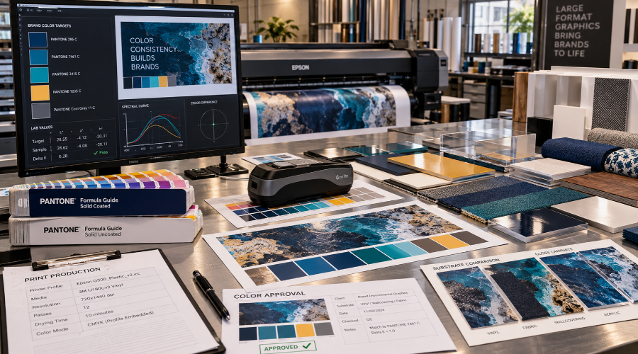
At Riot, we use Pantone color matching to help our clients keep brand colors steady across walls, windows, floors, displays, and other environmental graphics. First, we review the brand standards, target colors, artwork files, and final install locations. This step gives our team a clear path before any production work begins.
Then, we compare the selected Pantone colors with the print method, ink set, substrate, and finish. Not every surface reflects color in the same way. For example, vinyl, fabric, acrylic, and wallcovering can each change how a color looks under the same lighting.
Next, we create test prints when color accuracy matters most. These samples help us check the color before a full run. However, we also look at the space where the graphics will appear. Office lighting, daylight, and retail lighting can affect the final result.
- Review brand color standards and artwork files
- Match Pantone targets to print materials and ink systems
- Print samples for color review and approval
- Check lighting and viewing distance in the final space
- Document settings for future reorders and added graphics
After approval, we use controlled settings to print the final graphics. Our team tracks the material, printer, profile, and finishing details. As a result, future pieces can align more closely with the approved color direction.
Maintaining Color Uniformity Across Environmental Applications
Environmental graphics often cover more than one surface. A project may include lobby signage, privacy film, elevator wraps, dimensional elements, and printed wall murals. Therefore, we plan color across the full environment, not just one graphic.
We start by identifying which items need the closest match. A logo at reception usually carries more color importance than a background pattern. In addition, we consider viewing distance. Colors on a wall mural may read differently than colors on a small sign.
Material consistency also matters. When possible, we recommend using the same or similar substrates for connected visual areas. However, many spaces need mixed materials because of durability, code, texture, or installation needs. In those cases, we adjust production settings to bring the colors closer together.
We also help clients understand realistic tolerances. Pantone colors provide a strong reference, but output can vary by surface and process. Still, careful testing helps reduce surprises. It also gives stakeholders a sample they can review before installation.
For multi-location rollouts, our documentation becomes even more important. We record approved colors, profiles, materials, and finishing choices. Then, our teams can support added locations with fewer changes and clearer expectations.
Addressing Challenges: Accuracy, Materials, and Equipment Considerations
Color matching for environmental graphics involves practical limits. Screens show color with light, while print uses ink and material. Because of that, we do not rely on monitor color alone. We use production references and printed samples to guide decisions.
Ink behavior can also vary. Some colors fall outside the range of a specific printer or ink set. When this happens, we find the closest achievable output and review it with our client. This keeps the process direct and avoids late changes.
Substrate choice can create another challenge. Gloss finishes can make colors look deeper. Matte surfaces may soften the same color. Meanwhile, textured materials can scatter light and reduce sharpness. We account for these factors during sampling and production planning.
Equipment maintenance also supports consistent output. We calibrate devices, monitor print conditions, and use profiles suited to each material. Also, we keep approved samples available during production checks.
Best Practices for Designers and Printers
Achieving reliable Pantone Matching for Large Format Prints in environmental graphics requires a collaborative approach between design teams and print professionals. At Riot, we recommend starting with comprehensive color communication in the early project stages. This includes sharing accurate Pantone references and understanding substrate characteristics that may affect ink performance. When planning large format installations, we suggest conducting on-site tests and requesting printed proofs where possible. Regularly calibrating our equipment and using up-to-date color management software are essential in maintaining consistency across multiple prints and materials.
The Impact of Pantone Matching for Large Format Prints on Brand Consistency
Maintaining brand consistency is one of the primary reasons organizations invest in Pantone Matching for Large Format Prints. As environmental graphics become a key extension of a brand’s visual identity, accurate color reproduction helps reinforce trust and recognition. We have seen that even subtle discrepancies in color can alter the perception of a brand in large-scale applications. Through dedicated color management and precision matching processes, we help brands create cohesive experiences, whether the graphics are displayed in a retail setting, office lobby, or public space. The consistent use of Pantone colors in large format applications ensures branding elements appear unified, providing clarity to the audience.
Future Trends in Environmental Graphics and Color Matching Technologies
The field of environmental graphics continues to evolve with rapid advancements in print and color matching technologies. Looking ahead, we anticipate the integration of AI-driven color analysis, improved on-demand calibration, and more sustainable ink solutions will further enhance our ability to achieve Pantone Matching for Large Format Prints. Additionally, as materials diversify, the demand for adaptive color profiling across unique substrates will grow. At Riot, we are committed to staying informed about these innovations and continually refining our workflows, so our clients benefit from the most accurate and efficient color matching solutions available. Ultimately, the future holds significant promise for delivering even more precise and dynamic environmental graphics, supporting brand visions across every large-scale space.
FAQ
What are environmental graphics, and how does Riot use them?
Environmental graphics are visual elements integrated into physical spaces to communicate messages, enhance branding, or improve wayfinding. At Riot, we use environmental graphics to create immersive experiences in various environments, from offices to commercial spaces. These graphics help us reinforce brand identity and engage audiences through carefully crafted visuals.
Why is Pantone Matching important for environmental graphics?
Pantone Matching ensures color accuracy and consistency across every application. At Riot, maintaining our unique colors is crucial because even small deviations can impact brand perception. With precise Pantone Matching, we guarantee that our environmental graphics display our colors exactly as intended, regardless of the material or size.
How do large format prints benefit our commercial spaces?
Large format prints enable us to make bold statements, improve wayfinding, and maximize brand impact in expansive environments. Through the use of oversized prints, we can transform ordinary areas into visually engaging experiences, capturing attention while delivering our brand message consistently and effectively.
How does Pantone Matching work for large format prints?
Pantone Matching for large format prints involves selecting specific color codes from the Pantone system and calibrating our printers to match those standards. We continuously test and verify print samples to ensure that our graphics consistently represent our intended colors across all formats, promoting seamless brand cohesion.
What steps does Riot take to maintain color uniformity across environmental applications?
We standardize our production process, using calibrated equipment and consistent materials. In addition, we implement regular quality checks and strict adherence to Pantone specifications. This attention to detail helps us maintain uniform colors, even when graphics are displayed across different surfaces or lighting environments.
What challenges arise when achieving Pantone accuracy on various materials?
Different materials absorb and reflect ink uniquely, which can result in color shifts. To manage these challenges, we pre-test our graphics on each material and adjust ink formulas as needed. Thanks to these proactive measures, we can overcome common discrepancies and ensure consistent results across all substrates.
What equipment considerations are important for Pantone Matching in our large format printing?
High-quality calibration tools and advanced printers are essential for precise Pantone Matching. Our team invests in state-of-the-art technology and continuously updates our equipment. By doing so, we deliver vibrant, true-to-brand colors in every large format application.
How can designers and printers work together to achieve the best results?
Collaboration is key. Our designers and printers engage in constant communication to clarify expectations, share Pantone references, and review test prints. By aligning from concept to execution, we ensure every graphic faithfully represents our brand and meets our quality standards.
How does Pantone Matching for large format prints enhance brand consistency?
Consistent color builds recognition and trust. By using Pantone Matching throughout our large format prints, we eliminate color variations that might confuse audiences. As a result, our spaces speak with a unified visual voice, strengthening our overall brand presence wherever we appear.
What future trends are emerging in environmental graphics and color matching technologies?
Advancements in digital printing, color measurement devices, and sustainable materials are shaping the future of environmental graphics. Our team stays at the forefront by exploring innovative color management systems and eco-friendly inks. These trends empower us to push creative boundaries while maintaining our commitment to color perfection.