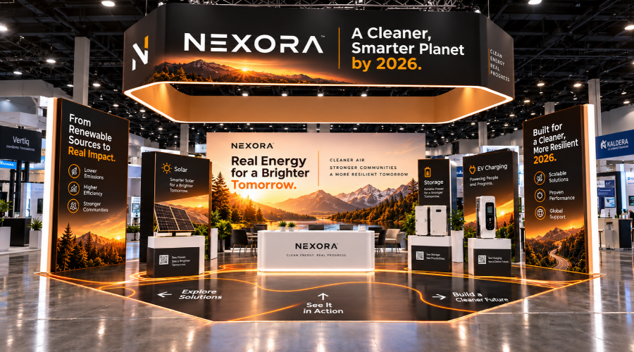
How Environmental Graphics Amplify Booth Messaging Effectiveness
Environmental graphics help visitors understand our message before we start a conversation. They shape the space, guide attention, and support sales teams during busy event hours.
At Riot, we think of each surface as part of the message. Walls, counters, hanging signs, windows, and floor graphics can all direct attention. However, each graphic needs a clear job.
Large graphics create recognition from a distance. Mid-level graphics explain value as visitors approach. Smaller graphics support product details, demonstrations, and next steps. As a result, attendees can move from interest to action with less friction.
We also consider how people walk through the aisle. For example, a message placed too low may disappear in a crowd. A message set too high may miss people already inside the booth. Therefore, placement matters as much as wording.
Color, scale, and contrast also affect how fast people read. Yet, we avoid adding visual elements only to fill space. Every panel should support a clear takeaway. In addition, the booth should feel consistent with other brand materials.
When environmental graphics work well, our team spends less time explaining the basics. Instead, we can focus on conversations, questions, and qualified leads.
Implementing the Booth Messaging Hierarchy Guide with Environmental Graphics
We start by deciding what the audience must understand first. Then, we map that message to the largest and most visible surfaces. This keeps the booth from becoming crowded with equal messages.
Next, we match each message level to a location. Primary messaging belongs on high-impact areas, such as back walls or overhead signs. Secondary messaging works well on side panels, reception counters, and demo zones.
Meanwhile, detailed content should stay close to the point of discussion. Product specs, QR codes, and offer details perform better near samples or staff areas. This approach helps visitors find information when they need it.
- Lead with one direct statement that explains what visitors should remember.
- Use supporting graphics to show services, product categories, or proof points.
- Place detailed content near demos, displays, or staff-led conversations.
- Keep type sizes readable from the expected viewing distance.
- Review sightlines from the aisle, booth corners, and entry points.
We also review the booth as a sequence. First, we ask what visitors see from across the aisle. Then, we examine what they see at ten feet. Finally, we check what supports the conversation at arm’s length.
This process helps reduce repeated messages. It also reveals gaps in the story. However, it does not require more graphics. Often, it requires better order and clearer placement.
Our production planning supports the same structure. Material choice, finish, lighting, and installation details should serve the message. For instance, glare can weaken a critical sign. So, we select surfaces with the event environment in mind.
Case Studies: Successful Brand Storytelling on the Show Floor
A technology client needed to explain three service lines in a compact booth. We used the back wall for the core promise. Then, we separated each service on vertical side panels. The team reported that visitors asked more focused questions.
Another client had a product launch with several technical features. Instead of listing every detail on one wall, we built zones. Each zone paired a graphic headline with the product in use. As a result, the booth supported a guided discussion.
For a healthcare event, our client needed trust and clarity. We used calm colors, strong contrast, and short statements. Also, we placed proof points near staff stations.
Key Takeaways: Integrating Hierarchical Messaging and Visual Strategy
At Riot, we understand that environmental graphics are more than decoration; they are a communication tool that can shape how visitors engage with our tradeshow booths. Throughout this guide, we have highlighted the importance of a clear, structured messaging plan. By employing the Booth Messaging Hierarchy Guide, we ensure our main value propositions are instantly accessible while secondary details support deeper conversations. This alignment of message and graphic elements leads to increased booth engagement and brand clarity on the show floor.
The visual strategy is most effective when it is intentionally layered with concise messaging. Our use of hierarchy in both design and content dictates how attendees navigate our space, what draws them in, and how our story unfolds. Successful integration relies on close collaboration between our designers, marketers, and event teams, reinforcing our message consistency and ensuring that every visual cue serves a purpose.
Common Pitfalls to Avoid in Booth Messaging Design
Even when following a strong framework, there are common missteps we aim to avoid. Overloading our graphics with information can overwhelm attendees and dilute our core messages. Consistency is essential; using mixed visuals, fonts, or tones can fragment our story. We must also consider sightlines and attendee flow – critical information should be positioned where people will notice it, not hidden at eye level when crowds are thick or only visible from one angle. Skipping pre-show evaluations or not updating graphics to match current products and messaging often leads to missed opportunities on the show floor.
Finally, not all environmental graphics are created equal. Durable, quality materials prevent distractions like wrinkles or fading, and flexible solutions allow us to adapt quickly to booth reconfigurations or new campaigns. These details ensure that our message remains professional and impactful from the first attendee to the last.
Next Steps: Leveraging the Booth Messaging Hierarchy Guide for Future Events
Looking ahead, we are committed to refining our approach to environmental graphics using the Booth Messaging Hierarchy Guide in every new project. The process begins with a strategic review of our current brand goals, followed by a detailed content outline ensuring all priority messages have a place in our booth environment. We collaborate across departments to finalize visuals that align with our objectives and match the scale and layout of each event’s venue.
Before each show, we test visuals for readability and relevance, seeking feedback to make incremental improvements. Afterward, we review what worked, what could be stronger, and capture new insights for next time. This cycle of planning, execution, and review positions us to continuously deliver memorable, effective tradeshow experiences for our clients. For more information about our approach to tradeshow booths and environmental graphics, we invite you to reach out and start the conversation.
FAQ
What are environmental graphics, and why are they important at trade shows?
Environmental graphics refer to visual elements integrated into physical spaces – like trade show booths – to convey brand messaging and enhance the attendee experience. Since trade shows are highly competitive, these graphics help us quickly communicate our value, draw attention, and create memorable encounters. Additionally, they reinforce our story throughout the booth, making a stronger impact than static signage alone.
What is the Booth Messaging Hierarchy Guide, and how does it benefit our trade show presence?
Our Booth Messaging Hierarchy Guide is a structured approach to organizing booth messaging by priority. By following this guide, we ensure our most critical story comes across first, while still communicating supporting details. This method helps attendees easily understand our offering, reducing confusion and improving engagement rates.
How do environmental graphics amplify the effectiveness of booth messaging?
Environmental graphics bring our booth to life. When we pair graphics strategically with our messaging hierarchy, they not only command attention, but also guide visitors naturally through our brand narrative. Moreover, the visual cues support retention and recognition long after the event, providing a cohesive and immersive experience.
What are the best practices for booth messaging in 2026?
In 2026, clarity and brevity are more important than ever. We recommend focusing on concise headlines, consistent branding, and interactive elements. Integrating digital media and adaptable graphics makes our messaging more dynamic. Additionally, aligning our visuals with current trends helps us attract modern audiences and stand out from competitors.
How do we implement the Booth Messaging Hierarchy Guide with environmental graphics?
We start by mapping our booth layout, then overlaying the key messages at strategic touchpoints based on visitor flow. Top-tier messages – our value proposition or brand promise – go in high-traffic, high-visibility areas. Secondary details are placed in zones where attendees are likely to linger. Ultimately, our careful placement ensures everyone receives the right message at the right time.
Can you provide examples of successful booth messaging using this approach?
Absolutely. For instance, at our last major event, we positioned a powerful visual at the entrance to state our mission. As visitors moved through the booth, interactive displays shared deeper stories, while environmental graphics reinforced our product advantages. Because each touchpoint supported the hierarchy, engagement increased significantly and visitors left with a clear understanding of our brand.
What are some key takeaways when integrating hierarchical messaging and visual strategy?
The main takeaway is synergy. We achieve maximum impact when our messaging hierarchy and environmental graphics work together seamlessly. Regularly reviewing both ensures our visuals always support the core message, while also allowing flexibility for future updates and campaign changes. This integrated approach not only boosts booth effectiveness but also elevates visitor satisfaction.
What are common pitfalls to avoid when designing booth messaging?
One major pitfall is overwhelming visitors with too much information. We must resist the urge to display every detail. Additionally, inconsistency in design or conflicting messages can confuse attendees. To avoid these issues, we stick to our messaging hierarchy and confirm that every graphic element supports our objective, not detracts from it.
How can we measure the effectiveness of our booth messaging and graphics?
We use a combination of visitor feedback, lead capture rates, and engagement data to gauge effectiveness. Observing visitor flow and dwell time at key messaging locations provides additional insights. By analyzing these metrics before and after implementing the hierarchy guide, we can continuously improve our strategies for greater results.
What are the next steps for leveraging the Booth Messaging Hierarchy Guide in future events?
First, we review our current booth setup and messaging to identify improvement areas. Next, we apply the guide’s principles to existing and upcoming graphics projects. Finally, we plan regular reviews after each event, incorporating feedback and performance data. By keeping this process iterative, we ensure ongoing trade show success and better ROI for our participation.